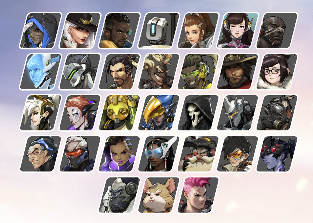
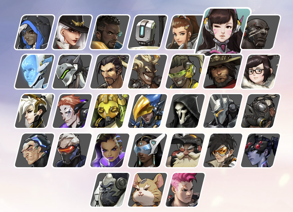
.container .heroes .hero .image{
    /* 부모 .hero의 크기를 기준으로설정, 크기 줘야 배경이 보임 */
    width: 140%;
    height: 100px;
    /* 이미지 가운데 정렬 */
    background-position: center;
    /* 이미지 축소 */
    background-size: 90px;
    /* 이미지 반복 제거 */
    background-repeat: no-repeat;
    /* 기울임 제거, 왼쪽+위로 이미지 이동 */
    transform: skewX(14deg) translateX(-16px) translateY(-10px);
}
<body>
    <h1>Hello World!</h1>
    <p>
        Lorem ipsum dolor sit amet, consectetur adipiscing elit.
        Phasellus vel tempor ex, sit amet dignissim nulla. In vel libero arcu.
        In faucibus, libero sed fringilla hendrerit, dolor lectus pulvinar ante, in aliquam ligula neque sed ante.
        Ut tortor purus, mollis ac dui nec, finibus dignissim elit. Aliquam at ipsum erat. Aenean vitae porttitor lectus, eu mollis est.
        Etiam blandit felis ut tellus accumsan tempus. Quisque dapibus risus id finibus sagittis.
        Maecenas semper nisl ac quam commodo, in pharetra neque condimentum.
    </p>
</body>
<body>
    <a href="https://google.com">Google</a>
    <p>
        1. 동해물과 백두산이 마르고 닳도록
        하느님이 보우하사 우리나라 만세
        무궁화 삼천리 화려 강산
        대한 사람 대한으로 길이 보전하세

        2. 남산 위에 저 소나무 철갑을 두른 듯
        바람 서리 불변함은 우리 기상일세
        무궁화 삼천리 화려 강산
        대한 사람 대한으로 길이 보전하세
      </p>
</body>
    <style>
        div{
            width: 300px;
            height: 400px;
            background-color: #24272b;
            background-image: url("../img/Jinx.png");
            /* background-size: 300px 400px; 위 이미지를 늘린것 */
            /* 이미지 사이즈(비율 유지 확대/축소): 기본값(auto), px */
            background-size: contain;
            background-repeat: no-repeat; /* 반복 안 함 */
            /*  방법1: top, bottom, left, rifht(조합 가능), center
                방법2: x축:100px y축:30px */
            background-position: center;
            background-attachment: fixed; /* 스크롤해도 이미지는 움직이지 않음 */
        }
        body{
            height: 3000px;
        }
    </style>
cover: 더 넓은 너비에 맞춤
contain: 더 짧은 너비에 맞춤
9. 띄움
9-1) float
<body>
    <img id="img1" src="../img/Viego.png" alt="비에고" width="150">
    <img id="img2" src="../img/Jinx.png" alt="징크스">
    <!-- <div style="border: 1px solid rgb(118,118,180);">영역</div> -->
    <p>
        Lorem ipsum dolor sit amet, consectetur adipiscing elit.
        In vehicula tempus sagittis.
        Ut non sagittis velit.
        Integer pretium commodo erat eget pellentesque.
        Proin in malesuada arcu, a tincidunt neque.
        Integer turpis libero, mollis mollis eros vitae, ullamcorper
        pulvinar dolor.
    </p>
    <p class="second">
        Cras volutpat odio ac aliquam mattis.
        In fermentum purus massa, id congue dolor lacinia eu. Nulla facilisi.
        Vivamus a scelerisque tortor, sit amet maximus mi.
        Morbi condimentum velit eget felis commodo, vel ornare lectus volutpat.
        In ac gravida neque.
        Suspendisse ex enim, efficitur et nunc quis, ullamcorper sollicitudin magna.
    </p>
</body>
  <style>
    #parent{
            /*부모 Div는 overflow:hidden을 무조건 설정
			 부모보다 자식의 width,height가 큰 경우 잘라내기 위해 */
             border:3px solid black;
            overflow:hidden;
            /*z-index: 부모가 무조건 자식 아래에 위치한다.*/

        }
        .child{
            border:1px solid blue;
            float:left;
            /*디테일하게 영역을 설정하기 위해선 float을 사용할 것.*/
            /*display: inline-block;*/
            height: 100px;
           background-color: antiquewhite;
           margin:10px;
        }
  </style>
11. 배치
11-1)
<body>
  <!-- position속성: 요소의 위치 지정 기준
    static: 기준없음(기본값)
    relative: 요소 자신을 기준(부모 역할)
    absolute: 위치 상 부모 요소를 기준(자식 역할)
    fixed: 뷰포트(브라우저)를 기준

    <position과 같이 사용하는 방향속성들:음수 가능>
      top, bottom, left, right, z-index(중요)
 -->
  <div class="wrap">
    <div class="container">
      <div class="item">1</div>
      <div class="item">2</div>
      <div class="item">3</div>
    </div>
  </div>
</body>
  <style>

    .wrap{
      width: 400px;
      height: 300px;
      background-color: tomato;
      /* 여기도 위치상 부모가 아니면 브라우저가 부모가 된다. */
      /* position: relative; */
    }
    .container {
      width: 300px;
      background-color: royalblue;
      /* absolute, fixed는 위치상의 부모 구조가 무너지는 경우가 있다. */
      position: relative;
    }

    .container .item {
      border: 4px dashed red;
      /* background-color: orange; */
    }
    .container .item:nth-child(1) {
      width: 100px;
      height: 100px;
      background-color: antiquewhite;
    }

    .container .item:nth-child(2) {
      width: 140px;
      height: 70px;
      background-color: azure;
      /*relative는 원래영역은 차지하고 있고 지정 좌표에 나타나므로 사용되지 않음*/
	  /* position: relative; */
      /*absolute는 위치상 부모요소를 기준으로 배치하므로 형제들을 신경쓰지 않고 위치한다.*/
      position: absolute;
      top: 30px;
      right: 30px;
	  /*container div가 위치상 부모요소가 되려면
      position: relative;로 설정해야 함
      만약 relative가 아니고 할아버지 요소가 relative면
      위치상 부모는 할아버지 요소가 된다.
      그것도 아니면 화면(뷰포트)기준으로 배치한다. */
    /*fixed: 뷰포트(브라우저)를 기준으로 생성:스크롤시 위치 고정 */
      /* position: fixed; */

    }
    /* position: fixed; 테스트시 설정*/
    body{
      height: 3000px;
    }
    .container .item:nth-child(3) {
      width: 70px;
      height: 120px;
      background-color: aquamarine;
    }
  </style>
11-2)
<body>
  <!-- 요소 쌓임 순서: Stack order
    1.요소에 position속성의 값이 있는 경우 위에 쌓임(static 제외)
    2.1번 조건이 같은 경우, z-index속성의 숫자 값이 높을 수록 위에 쌓임
    3.1번2번 조건까지 같은 경우, html의 다음 구조일 수록 위에 쌓임
  -->
  <div class="container">
    <div class="item">1</div>
    <div class="item">2</div>
    <div class="item">3</div>
  </div>
</body>
<body>
  <!-- z-index속성: 값이 높을수록 위에 쌓인다(기본값:auto(0), 너무큰수는 관리가 힘듬)
    1.요소에 position속성의 값이 있는 경우 위에 쌓임(static 제외)
    2.1번 조건이 같은 경우, z-index속성의 숫자 값이 높을 수록 위에 쌓임
    3.1번2번 조건까지 같은 경우, html의 다음 구조일 수록 위에 쌓임
  -->
  <div class="container">
    <div class="item">1</div>
    <div class="item">2</div>
    <div class="item">3</div>
  </div>
  <hr>
  <span>Hello!</span>
</body>
<body>
    <!-- 인라인 방식: 다른 것보다 우선순위가 높지만 관리가 힘들다.
        같은 디자인을 입력하고 싶을 때 코드가 길어지고 귀찮음 -->
    <div style="color:rgb(118,118,180); margin: 40px; border: 1px solid rgb(25,25,112);">영역</div>
</body>
</html>
<style>
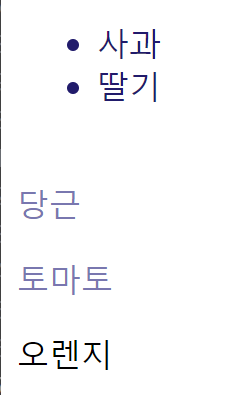
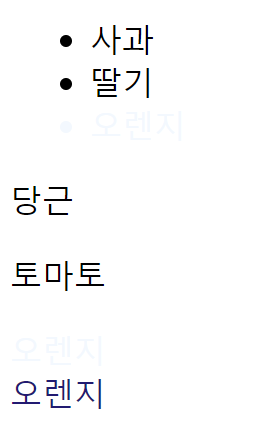
/* 인접 형제 선택자: .orange의 다음 형제 요소를 하나 선택 */
.orange+li{
color: rgb(118,118,180);
}
/* 일반 형제 선택자: .orange의 다음 형제 요소들을 선택 */
.orange~li{
color: rgb(25,25,120);
}
</style>